Where Is This? Revealed

July 4, 2012 § Leave a comment

Where Is This?

Did you guess? Did you try? Have you been here?

Answer: Inca Ruins in Saqsaywaman, Peru

Dreaming of a Far Away Place, Place8 Revealed

Photo: Nicolas Raymond, Montreal, Canada- Go here for this picture as a Free Facebook Cover
Dighton Design is your Boston – Providence graphic designer!

Where Is This? Revealed

July 2, 2012 § Leave a comment

Where Is This?

Did you guess? Did you try? Have you been here?

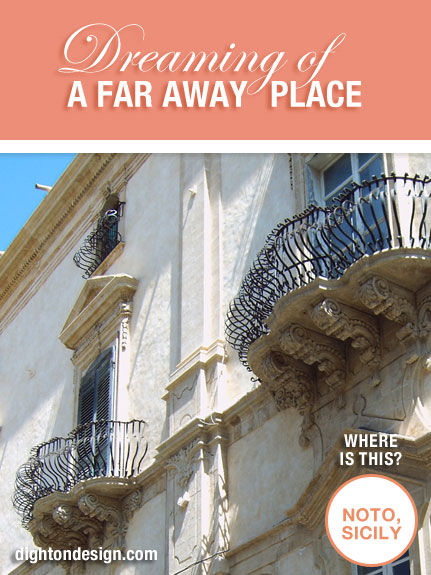
Answer: Noto on Sicily, famous for its baroque balconies.

Dreaming of a Far Away Place, Place7 Revealed

Photo: Eva Schuster, Dresden, Saxony, Germany – Go here for this picture as a Free Facebook Cover

Dighton Design is your Boston – Providence graphic designer!
Dispersion Effect Using Photoshop

July 1, 2012 § Leave a comment

Want to create a dispersion effect using a photo of you with photoshop?

To create a cool dispersion or fragments effect in photoshop, follow these steps:

  1. Take a photo of yourself with a white background (it is easier to cut out the photo from a white background)
  2. Download free brushes from Adobe Exchange: www.adobe.com/cfusion/exchange
  3. In photoshop, cut out the white background, keep background transparent
  4. Watch this video: Follow the instructions.
  5. or Watch this video: Follow the instructions.
  6. Create a Dispersion Effect with Your Photo
  7. Show us the results by mailing it to: fran@dightondesign.com

Can’t wait to see what you do!!

Creating an Ad Promoting Adobe Photoshop CS4

June 29, 2012 § Leave a comment

Creating an Ad Promoting Adobe Photoshop CS4, Using CS4

This video used fast motion to create a magazine ad promoting Adobe Photoshop CS4, using Adobe Photoshop CS4. Inspiring and entertaining.  Suggestion: mute or turn down the volume BEFORE playing. The inspiration is in the WATCHING.

What Are the 3 Elements of a Magazine Ad?

June 28, 2012 § Leave a comment

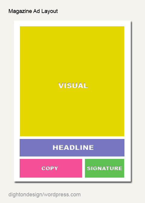
The three elements of a magazine ad, according to Amit Sati, of Inkzoo, are layout, visual and copy.

Magazine Ad Layout

Layout of a magazine ad should hold everything together by keeping it simple, contrasting and balanced.

Visual of a magazine ad, though not required, should draw attention to the ad. Research indicates that 70% of people will only look at the visual in an ad. Since people prefer to relate themselves realistic photos photographs seem to appeal to target customers.

Copy of a magazine ad should include: Headline, Subhead, Body, & Signature. Research indicates that 30% of people will read the headline in an ad.

Read the full article of How to make your Magazine Ad Memorable here: design.inkzoo.com

New to Adobe InDesign? Create a Quick Ad

June 27, 2012 § Leave a comment

New to Adobe InDesign? Use InDesign to Create A Quick Magazine

Follow Alease Michelle’s Tutorial Slides to learn how to make a quick magazine ad using Adobe InDesign.

Where Is This? Revealed

June 25, 2012 § Leave a comment

Where Is This?

Did you guess? Did you try? Have you been here?

Answer: The small island of Mabul

Dreaming of a Far Away Place, Place6 Revealed

Photo: Jin Neoh, Penang, Malaysia – Go here for this picture as a Free Facebook Cover

Dighton Design is your Boston – Providence graphic designer!
The Secrets of Good Print Advertising

June 25, 2012 § Leave a comment

To create an ad yourself Duncan McAdams, of market storm, says, “The headline of any advert really is the MOST important part – you must engage the reader to read on. You don’t need to be smart or clever just get them interested.”  He says that headlines can be broken down roughly into three types: self interest, news and curiosity.

He says that your headline makes the reader want to read on.  He suggest you need to make it sexy, interesting, challenging, or address a problem.  He gives these tips on creating headlines:

  • Use Longer Headlines, Rather Than Shorter Headlines
  • Use an Easy-To-Read Font
  • Place The Headline At The Top of The Page
  • Use Bold or Underlining to Stress Words
  • Avoid Using All Capital With a Long Headline
  • Avoid Being Negative, Boring or Meaningless
  • With Long Headlines, Make Non Essential Words Smaller, Essential Words Should Be Larger

Read the full article on part 1 of Secrets of Good Newspaper and magazine Advertising for YOUR Business here: marketstorm.co

……………..

To create an ad yourself Duncan McAdams, of market storm, continues explaining, “The next important part of a good advert is the text or copy. Here are 3 different ways you can keep the reader’s interest and by using these tricks/secrets/techniques you will get excellent response.”  He says that effective copy or text can be broken into three styles of advertising: straight to the point, tell a story, or facts & figures.

McAdams suggests that you know your audience and he offers a quick list of do’s and don’ts for writing copy:

Do’s

  1. Use testimonials from happy clients.
  2. Don’t be afraid to blow your own trumpet – loudly.
  3. Include a “call to action” – buy now, call us today, be quick.
  4. Use limited offers.
  5. Long copy works better than short copy.
  6. Emphasize your unique selling proposition.

Don’ts

  1. “No copy” is a waste of time – your contact details and two words.
  2. No humour – no body buys from a clown unless you are a clever clown.
  3. Oh so you are a smart cookie – don’t be clever – you are not entering a writing competition and only one other person in the world will understand.
  4. No poetry – ’tis for poets – stay away.
  5. Don’t make outlandish claims or tell whoppers unless you are selling “whoppers”.

Read the full article on part 2 of Secrets of Good Newspaper and magazine Advertising for YOUR Business here: marketstorm.co

What Makes a Print Ad Successful?

June 24, 2012 § Leave a comment

To judge a print ad Michael Kristof, of kristocreative.com, has seven questions to keep in mind.

1. Did the print ad grab your attention?
With the average consumer being bombarded by thousands of messages on a daily basis, the ad must do something to attract the reader’s/viewer’s attention. In some cases, you have less than a second to do so.

2. Did the print ad hold your interest?
Did the headline hold your interest long enough to even care about reading more?

3. Did the print ad communicate quickly?
Did it communicate the message quickly and directly without making you guess what was going on? Or was there so much information on the page that it gave you a headache just looking at it?

4. Could you relate to the message?
Did the ad communicate its point in a way that you could understand or relate to? Note: When considering this point, it’s important to keep in mind you may not be the intended target audience. So in order to be objective, first consider who the product or service is directed to, then try and put yourself in their shoes.

5. Did the message create a desire for the product or service?
Each ad, on some level, should create a desire for the product by revealing appealing features or positive qualities about the product or service.

6. Did it have a specific call to action?
Did the ad ask you to do something? The only time an ad should not include a call to action is… well, never. An ad must always contain some sort of instruction to the reader. It may be as simple as a website address or phone number tucked into a corner, but it needs to have something.

7. Was the print ad memorable?
Did the ad affect you such a way that you actually remembered the advertisement and the product it was selling? Or did you only remember it because the monkey in the picture was wearing a coonskin hat?

Read Full Article Here: kristofcreative.com

What Makes an Ad Successful?

June 23, 2012 § Leave a comment

The key components to a successful ad are, according to Megan Gambino of Smithsonian.com, “The ability to attract positive attention—that’s key—and to communicate clearly an interesting idea about a product or service. We are selling the products and services of clients, but if you look at it through the other end of the lens, what are we doing for consumers? Are we just annoying them, or are we doing something useful? I think what we are doing is introducing people to potentially better choices in their lives.”

Read Full Article Here: smithsonianmag.com